Buttons
USAGE
Buttons are used to trigger an action. Some typical examples include Sign up, Create, Delete. Buttons express what action will occur when the user clicks or touches it.
Buttons are used to initialize an action, either in the background or foreground of an experience.
BUTTON TYPES
Button 50
These are primary call-to-action buttons used for dialogs, forms and settings interfaces.
Basics

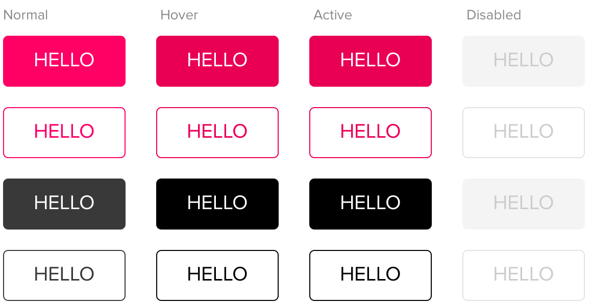
Variants and state examples

Check Button 50 behavior on MURAL Storybook
Spinner button
Spinner button is a variant of the Button 50. It includes a specific feedback to express some async operation is awaited.

Check Spinner button behavior on MURAL Storybook
Copy button
Copy Button is used for copying a link to the clipboard.
It's a special version of the Button 50 style.
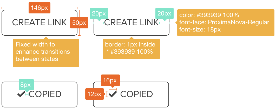
Note that there are specific width and font-size specs:
- Width is 146px fixed to support minimum margins for the "Create link" label state.
- Font-size is 18px instead of 20px because this button is always used right to an input field (font-size 18px) displaying the url to be copied.

States
Copy Button has 3 states:
- Create link
- Copy link
- Copied feedback

Specs

Transition
Moment 1: Copy Link to Copied feedback
Element COPY LINK
Opacity : 0-100%
Duration : 0.3 sec
Motion : Ease outElement COPIED
Opacity : 100%-0
Duration : 0.1 sec
Motion : Ease in
Moment 2: Copied feedback to Copy Link
Once COPIED reach 100% opacity, it waits 0.5 and then:
Element COPIED
Opacity : 100%-0Duration : 0.1 sec
Motion : Ease out
Element COPY LINK
Opacity : 0-100%
Duration : 0.1 sec
Check Copy button behavior on MURAL Storybook
Button 40
This button style is used for relevant actions inside complex forms or dialogs. It also has a variant as dropdown.
Basics

States

Button 34
Basics

Button couples
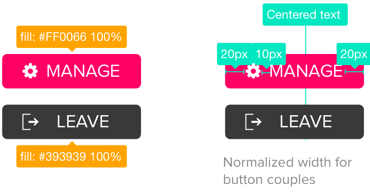
For interfaces where buttons work together, like Manage and Leave, we take advantage of color variants, and add an alignment rule for the text in order to normalize width for both buttons.

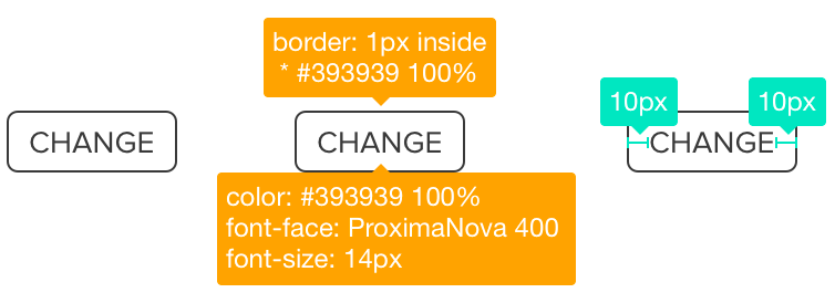
Button 28
Basics

Variants

States
Note: Color variants and states are equivalent to those defined above for Button 50.
RELATED DOCUMENTS
- To check further visual buttons specs: Download Buttons Spec [Sketch file]
- To see this button behavior live: Check MURAL Storybook
- To create new prototypes using Sketch symbols and library: Download MURAL UI Kit Master [Sketch file]