Modal dialogs
USAGE
Modal dialogs are used to validate user decisions or to gain secondary confirmation from the user. Typically, the user needs to take an action or cancel until he can continue interacting with the original page.
Important: Modals have been considered a UI anti-pattern because they interrupt users and force them into doing a specific action. Arguably, in most cases, there is no need to force users into specific actions.
Use only when there's a strong need of interrupting or catch the user’s full attention to something more important.
MODAL DIALOG TYPES
Modal 600
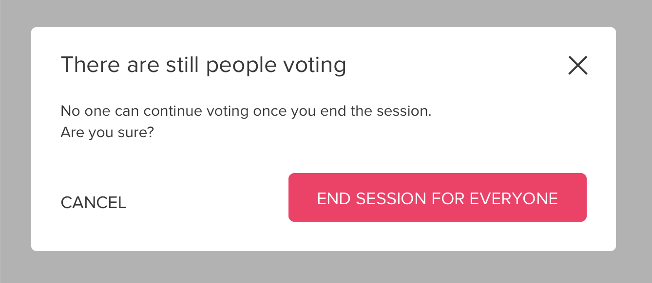
This is the main style used for modal dialogs.
It includes a title, a body and a footer.
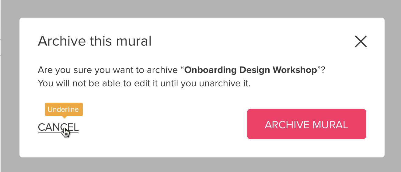
The footer includes a main call to action and an access to cancel.
Basic specs
Hover
Height and margin variants
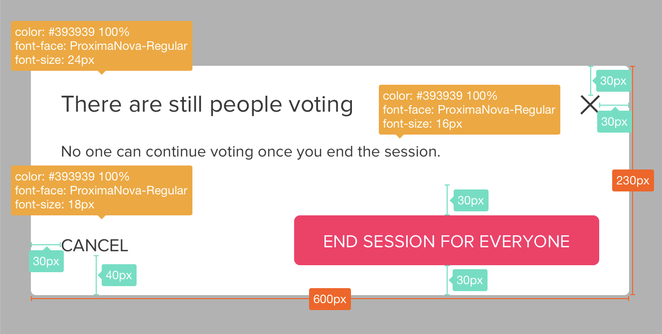
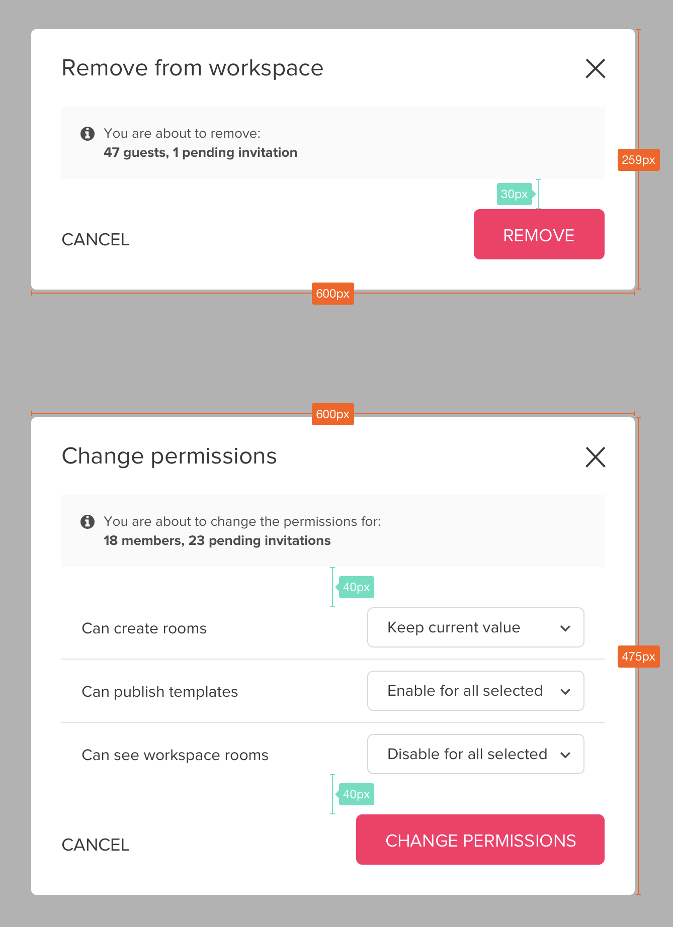
- Modal 600 has a minimum height of 230px that works perfectly for 1 or 2 lines paragraph text.
- Modal height extends according to content.
- Margin between blocks of content may vary between 30px and 40px, according to layout hierarchies.
3 call to action exception
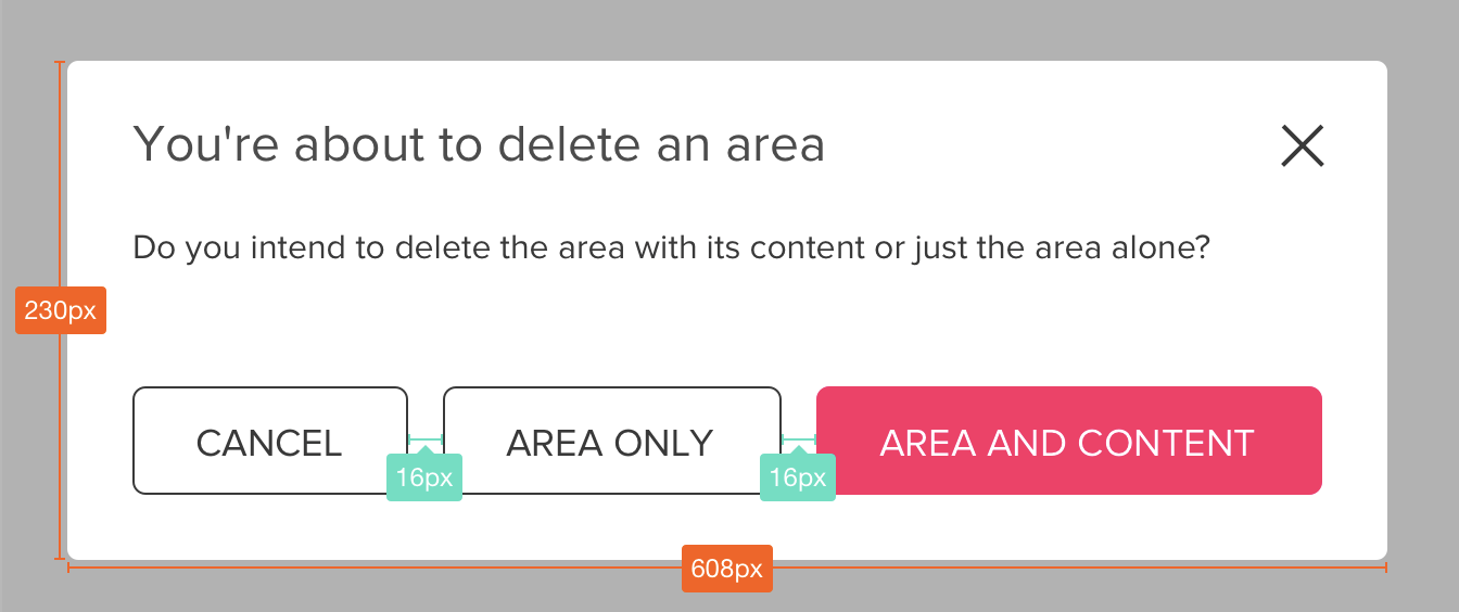
- For dialogs that imply 3 call to actions like this one, every action has a BUTTON 50 style.
- Margin between buttons suggested is 16px.
