Dropdown menus
USAGE
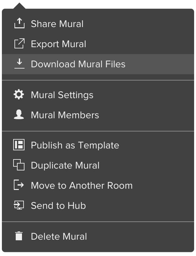
Dropdown menus are key components of MURAL navigation system. They allow users to jump from one interface to another quickly. The mural dropdown menu, for example, is the one providing the main actions of a mural, and some other shortcuts needed from that context. The same logic works for the room menu, and the mural thumbnail one.
Dropdown menus vary in size, but there are some fixed widths to consider.
They all share the same style overall, with some variants specified below.
TYPES
Dark dropdown menu
The dark version has a #393939 background and corresponding color specifications.
Mural menu
Specs
A few considerations for text:
Capitalize the initials for every new word. This makes action's text more legitimate to click (affordance).
Try to limit your action's Text to a maximum of 2-3 words.
For format specs see the images below: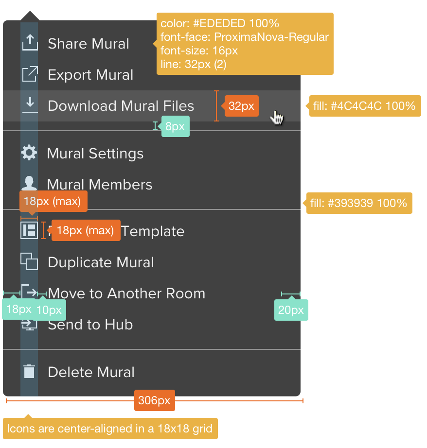
Arrow positioning and size:

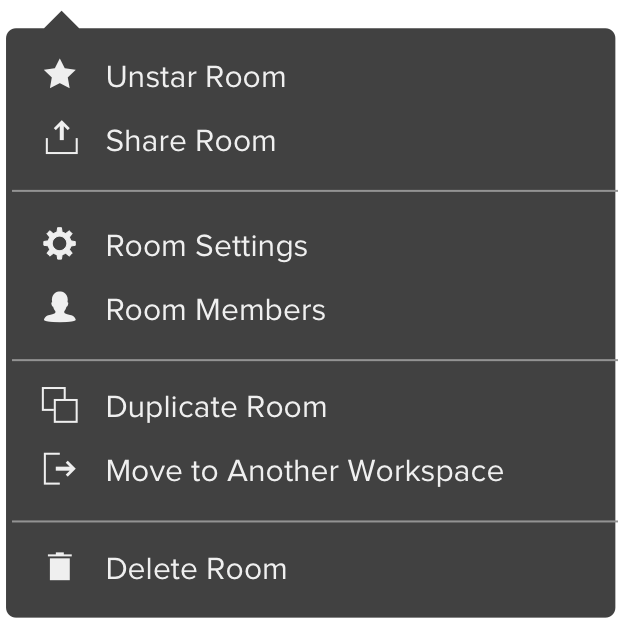
Room menu
Light dropdown menu
The light version has a white background.
Help menu
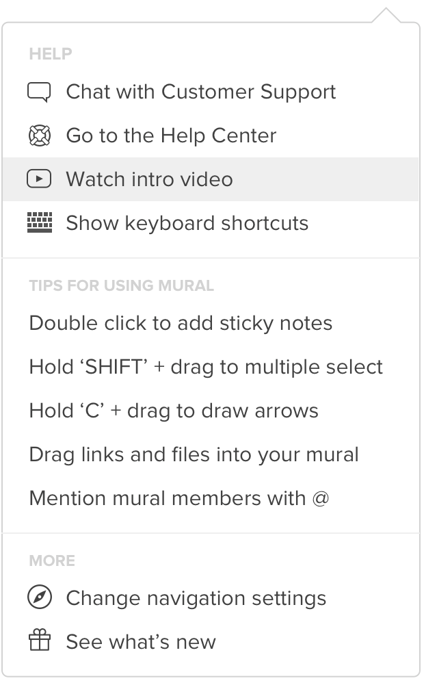
Specs
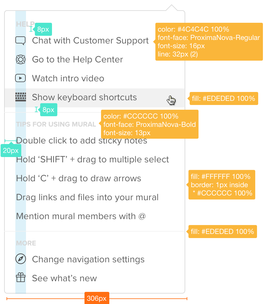
Most style details are already specified in the dark version above.
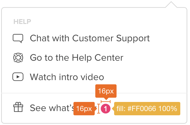
The following images includes new specs for:
- Section titles
- Menu items without icon
- Color changes needed for light version
- What's new updates number
Applications
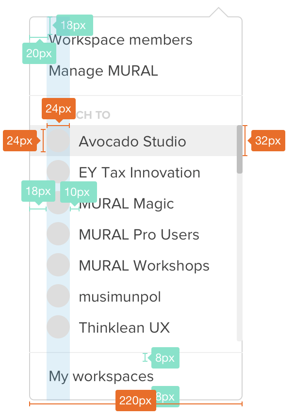
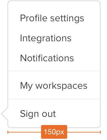
The following are specific and worth mentioning applications of the dropdown menus style.
Workspace menu
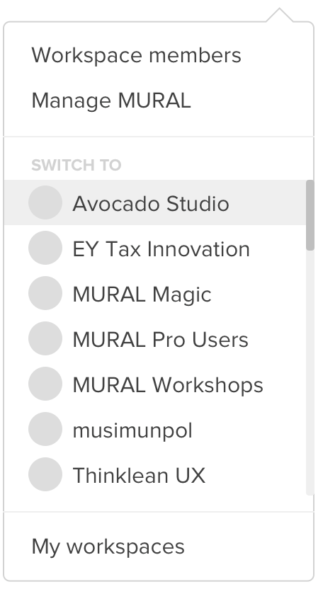
Specs
User menu
Mural thumbnail menu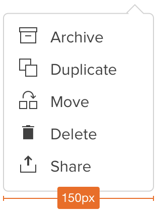
Example and template menu
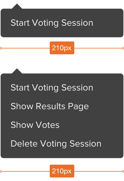
Voting menu
